Table of Content
- Introduction
- What is Mobile-friendliness?
- Importance of Making your Website Mobile-friendly
- How to Optimize your Website for Easy Mobile Visibility and Accessibility
- Conclusion
Introduction
Statistics show that
people visit search engines on mobile devices more than twice the number of
times they do on computers. This is because mobile devices are easily
accessible. Whether you are at home, at work, or on the go, you can easily get
a hold of your phone to search for different things online.
You can use your phone
to respond to emails, chat with friends, keep track of the news, watch YouTube
videos, etc. All these and more keeps the average person glued to his/her
mobile phone per time. This is why going mobile with your website just seems
like the best thing to do to improve your website.
1. What is Website Mobile-friendliness?
Mobile-friendliness is the attribute of a website that enables it to adapt appropriately to mobile devices for easy accessibility. Your website should look great and function well on any device that is used to access it. But that can't be the case if your website isn't designed to be responsive and adaptive to all devices.
This is why you should optimize your website to respond adaptively to the device your visitor is using to access your site. Most people seem to think that having a mobile-friendly website is all about having a site that is easily adaptive to all devices, but there's more to mobile-friendliness than that.
A mobile-friendly site should be adaptive and accessible to all devices. Its content format should look appealing, and its pictures should also appropriately fit whichever screen. Read on to find out more reasons you need a mobile-friendly website.
2. Importance of Making your Website Mobile-friendly
- Search Engines Prioritize Mobile-Friendly Websites
Google algorithms place a priority on mobile-friendly websites over those that are not mobile-friendly when ranking search engine results. Since lots of people are conducting Google searches via mobile devices, Google had to device a method to make browsing easy for mobile devices visitors. This need birthed the prioritization of mobile-friendly devices with the help of Google algorithms.
So, when people conduct Google searches via their mobile devices, mobile-optimized websites rank better than those that are mobile optimized.
Hence, to keep up with the trends of this present era, you have to make your website mobile-adaptable. Else, you'd quickly fall by the wayside. Your site might get deranked by Google and other search engines. Your overall visibility would reduce, and overall, your revenue would get affected since customers are getting far from your site.
- People now Use Mobiles more Frequently than PC
People usually use their mobile devices to do most of their simple internet searches- from searching for random information online to buying things online, down to interacting with others on sites like Quora and Reddit. Why? It is fast and easy, compared to having to get hold of a laptop. Since most online activities are now carried out using mobile devices, having a website that isn't optimized for mobile users can discourage people from visiting your site.
The reason is that they don't want to use a site that is hard to navigate or understand. If your website is also used for marketing your business, not making it mobile-friendly means that you are pushing your customers away. Imagine that someone comes across your site and tries to reach out to you for a partnership. The person might get put off by an unresponsive site that is the handiwork of mobile-unfriendliness. Of course, the person won't have an idea that the site looks better on a desktop. That first impression may very ruin everything. This is why you should make your website mobile-friendly and accessible. It could be the push your business needs.
- It Gives your Brand More Credibility
A little on this has been said in the previous point. The standard practice for websites now is for them to be mobile-friendly. This means that websites without this particular feature would seem out of place. They'd seem outdated or even spammy. In this fast-paced digital era in which most websites aim to stand out positively, you shouldn't be left out.
Your website should be made responsive, adaptive, visually appealing, and accessible to all for it to look credible. Since people expect all sites to look functional and sophisticated now, any website that doesn't meet this standard would be deemed spammy and suspicious.
So, to appear rightly credible before your existing customers/clients and potential ones, you should program your site to be mobile-friendly. Doing this would boost their user experience and encourage them to buy your products or request your service.
When websites don't properly fit mobile screens, people don't see the need to linger on those pages. Instead, they go back to the initial Google result to check out other mobile-friendly websites. You might think this is insignificant because visitors that really value your content would stay back to read it that way, but it doesn't work that way.
People browsing through their mobile devices don't have much time to spare on any site that would stress them out. If the site doesn't offer what they want; they don't waste time before heading to another site. And you know what this means? Your site would record a higher bounce rate.
Recording a higher bounce rate on your website would give Google algorithms the impression that your site is irrelevant and without valid information to offer the searchers. This could then get your page deranked to give top search result access to other sites that can better serve the searchers. So, you need to make your website mobile-friendly in other to keep bounce rates at the barest minimum.
3. How to Optimize your Website for Easy Mobile Visibility and Accessibility
From simple improvements to complex technical adjustment, there's so much you can and should do to make your website mobile-friendly. Here are 5 things you should look out for to make your site adaptive to all devices.
- Have only Well-experienced Developers Design your Website
If you are just about creating your website, you should ensure that mobile-friendliness is one of the features integrated into its design. You should know, though, that not all website designers can create a top-notch mobile-friendly website.
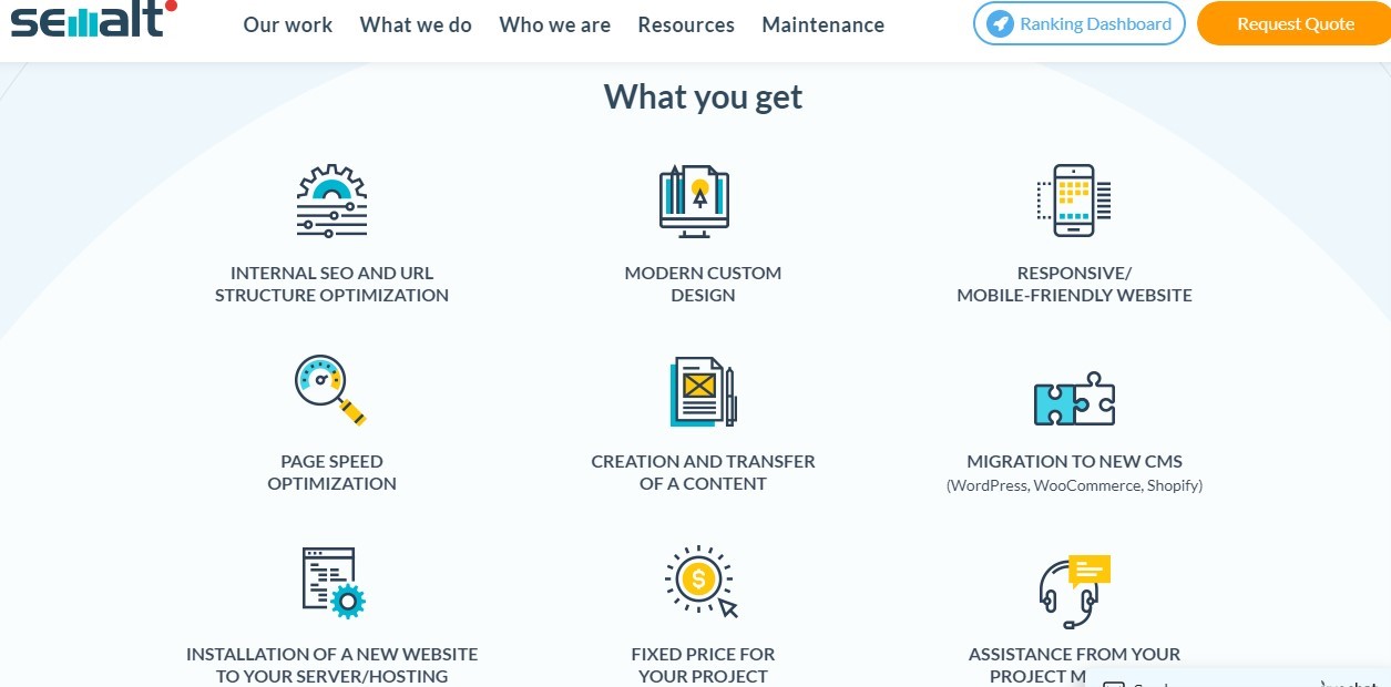
You should
contact Semalt to help you create a website that would be highly functional and sophisticated, yet user-easy in all ramifications. If you have your website already, you should still contact Semalt to make some technical adjustments to your website in order to make it mobile and user-friendly.
When browsing the internet via mobile devices, most people have little or no patience for pop-ups. This is because it can be annoying, distracting, and time-wasting. Pop-ups might seem insignificant on desktops and laptops but on phones; most people just can't stand them. So, you should make your site mobile-friendly by limiting pop-ups and only using them where absolutely necessary.
- Limit Distraction from Ads
Ads might seem like an additional method for you to make money through your site, but they could be hurting your site just as well. Like pop-ups, ads can be frustrating, annoying, and distracting, particularly for sites with them in excess. They could make your website slow and even make it look spammy. So, you should try to limit the number of ads that appear on your site to make it remain user-friendly.
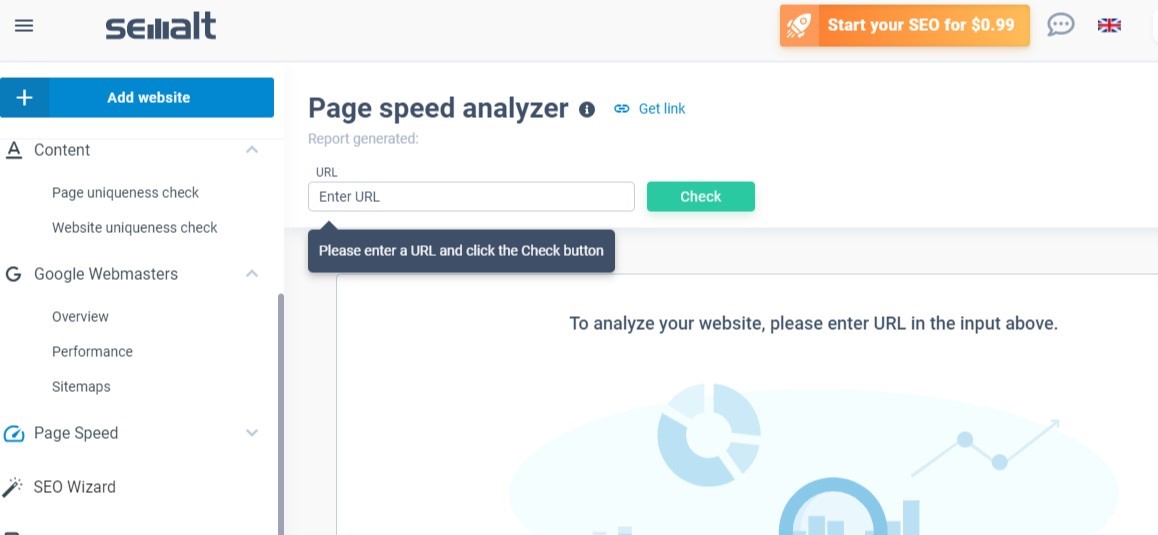
People can't afford to spend much time on a page while waiting for it to load, particularly when using mobiles. If your site loads slowly, they'd log out fast and move on to the next website to get the information they seek. This is why you should endeavor to boost your website's loading speed. You can use Semalt's speed analyzer to test your site's loading speed. Besides, Semalt's website specialists can help carry out technical adjustments on your site to make it user-friendly.
To make your site fully mobile-friendly, you should ensure that its content looks appealing on all devices. The text shouldn't be too big or too small. The paragraphs should be relatively short with appropriate spacing. Neither should the display color be lighter than necessary. All these might still be overlooked on desktops and laptops, but on mobile devices, they matter greatly because they could be the difference between a site that looks accessible and a site that looks off-mark.
Conclusion
Mobile devices are considered the most preferred medium for accessing content online, so you should optimize your website to fit that bill. Try not to ignore the impact of visitors via phones, tablets, iPads, etc. because they do matter. No matter how hard you try to set up your SEO, if you neglect the aspect of mobile-unfriendliness, your website would be negatively affected by the impact. So, why not your A-game on with website mobile-friendliness? Endeavor to make use of the tips above to make your website mobile adaptive, and accessible. Also, remember to reach out to Semalt to get that perfect website you so desire.